HAGS
Brand refresh for international outdoor recreational equipment manufacturer
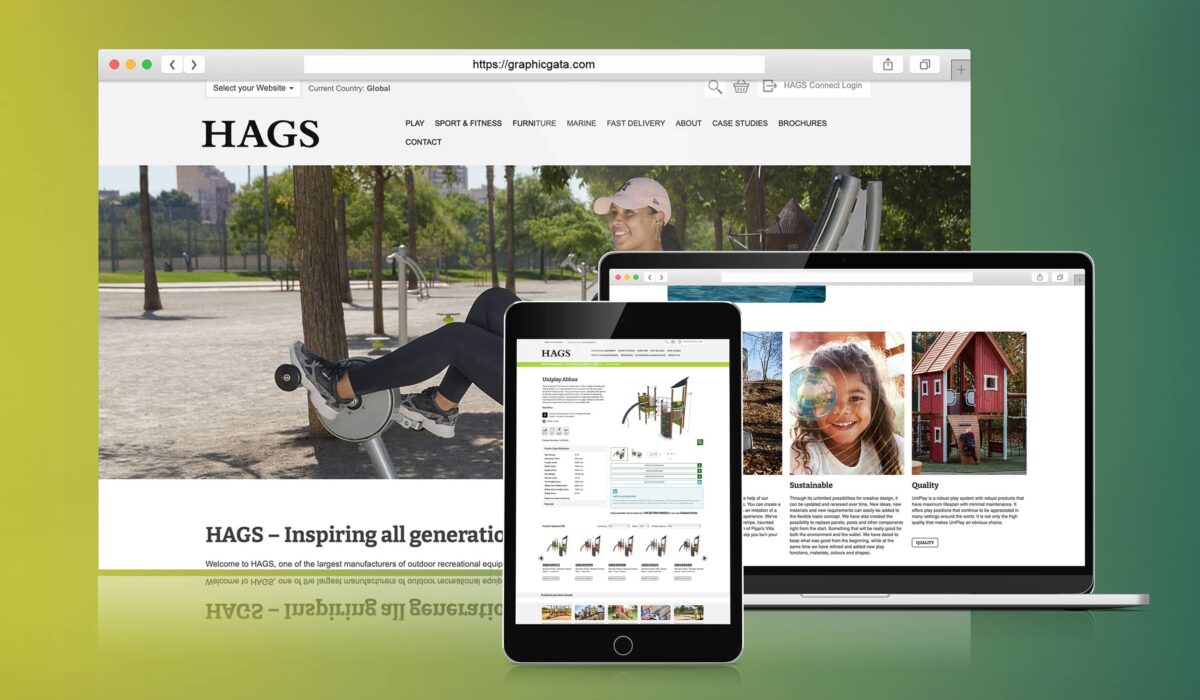
We’ve worked closely with the HAGS marketing team for a number of years, building, updating and maintaining their website using the Dynamic Web platform.
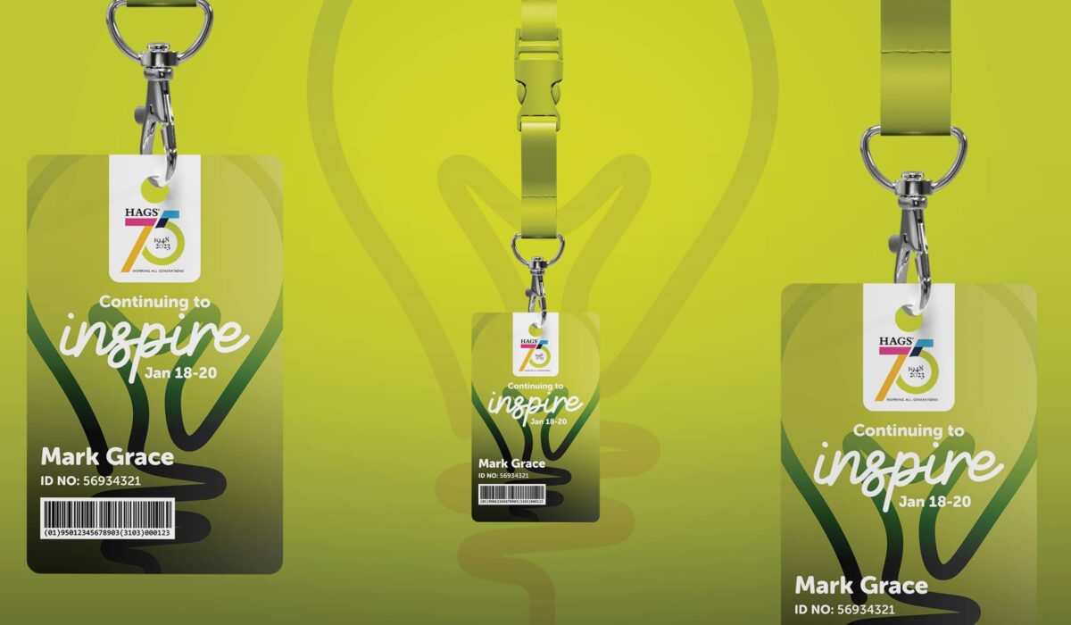
HAGS manufacture and supply a complete range of top quality playground equipment, sport and fitness equipment and urban furniture. Although it’s now owned by Playpower who are a US company, their roots are proudly Swedish and their strapline of ‘Inspiring all generations’ is a sentiment that everyone at HAGS understand and strives to deliver.

HAGS asked us to help them refresh their understanding of what customers are looking for, to gather feedback from employees on their perception of the brand and the market and to review the way the HAGS brand represents itself.
Interpret + Define
We started the project with 30 one-to-one interviews with HAGS employees, distributors and customers. The conversations were broad in scope, covering their views on HAGS, their competitors and customers’ met and unmet needs. We bolstered these findings with a comprehensive competitor review looking at each brand’s positioning in the market, their proposition, brand style and how they portray the brand through content, their website and social channels.
The research phase revealed that the proposition was differentiating and motivating, but that the ambition to ‘Inspire all generations’ wasn’t being delivered through the brand design.
Imagine + Create
We reviewed the research in detail to understand exactly how the brand needed to evolve – which elements should be retained, which might need to be amended and where new creativity was required.
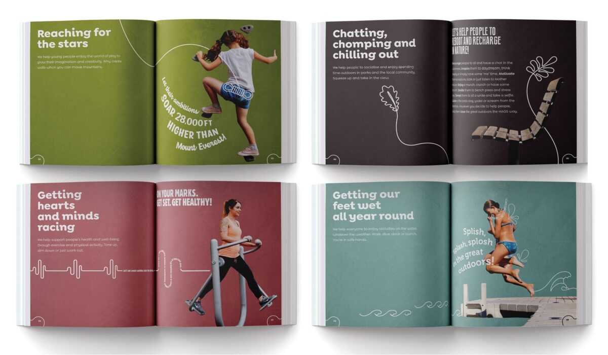
A critical consideration for the HAGS brand is that it offers playground equipment, sport and fitness equipment and urban furniture. The semiotics of each of these categories are different, so our challenge was to create a brand that could flex to appeal to buyers in each category whilst still retaining a strong and meaningful core brand identity.
Rise + Shine

Our brief for the brand style was to really deliver ‘Inspiring all generations’, whilst keeping the existing logo. We defined a colour palette for each of the different product categories to better appeal to buyers in those markets whilst still keeping a consistent overall look and feel.
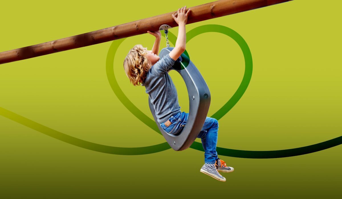
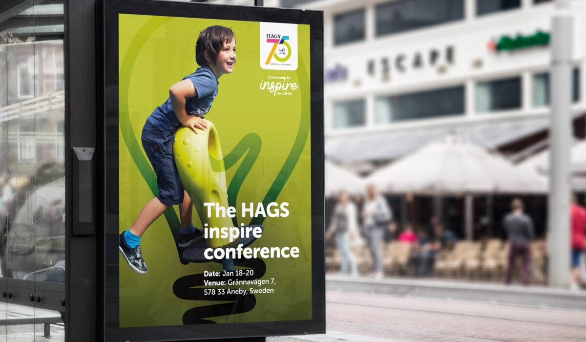
To stand out from competitors we created a distinctive photography treatment that highlights people of different generations using and enjoying HAGS equipment. We also introduced a new family of typefaces to add some character and fun.
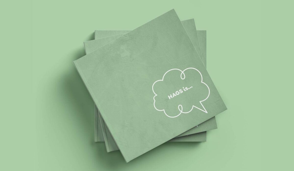
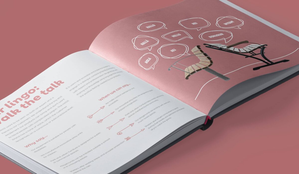
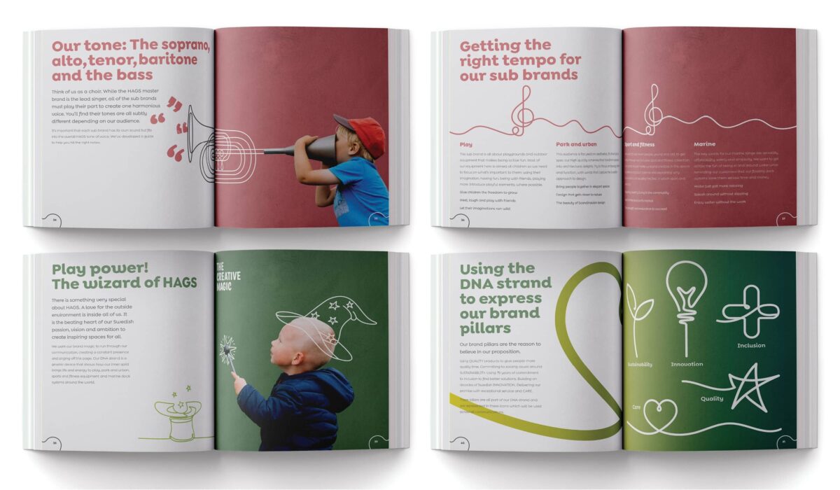
As with all brand projects, simply creating a new style is only half the battle. We helped the internal rollout by creating a brand book that explains to all HAGS colleagues and partners who the brand is, what it stands for and what makes it different.
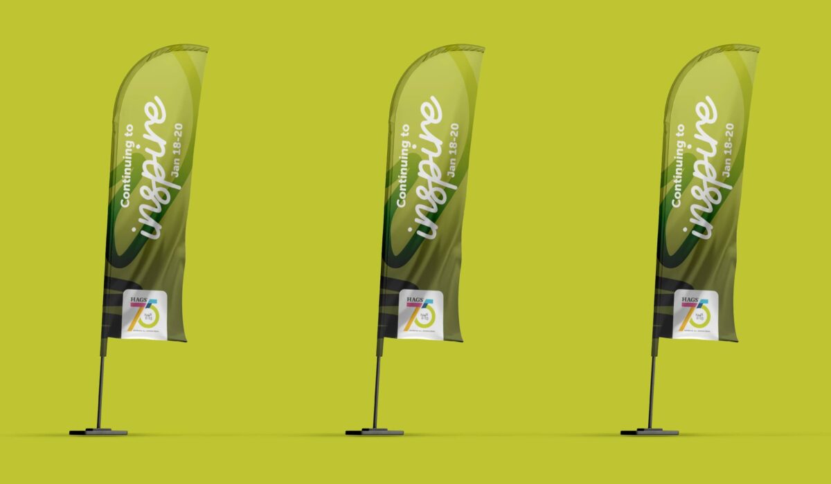
We launched the rebrand at the HAGS Sales Conference in Krakow, where colleagues discovered the engaging style for the first time. After celebrating 75 years in business, we've helped HAGS highlight their brand values in a way that will connect and resonate with the next generation.