Salts Healthcare
Global Rebrand for one of the UK's oldest healthcare companies
Salts Healthcare
Salts Healthcare is one of the oldest family-run companies in the UK. With headquarters in Aston, Birmingham, they manufacture and distribute ostomy appliances and additional products in 24 countries worldwide. With ambitious expansion plans and recent growth in export sales, Salts wanted a fresh, forward-thinking and simplified look to their communications.
Interpret + Define
A few years ago, Salts Healthcare was the fast follower. Now, this family-run ostomy manufacturer is the industry innovator. With the company’s investment in new product development and additional plant and machinery, they are on track for continued growth and increased sales, especially in emerging markets.
With exports now representing an increasing percentage of the company’s turnover, they needed to ensure their communications had the gravitas of an international brand and could also be easily selected and translated into different languages.
Salts Healthcare had a huge range of products, all with different brand names. But our research revealed that ostomists are often unaware of which brand of appliance or products they are using and that the decision usually comes down to their stoma care nurse.
Could we find a way to simplify our branding and packaging to make selection easier for everyone and get people to buy into Salts as a brand?
Imagine + Create
We helped Salts to hone down their vision and values and developed a new brand promise – Caring, Listening and Innovating to Improve Lives. This informed the style of the new branding and marketing communications.
Overall, we agreed to make the design feel modern and fresh, while also stripping back product names and helping Salts Healthcare to become a unified branded house rather than a house of brands.
By getting the product selectors e.g. nurses and patients to choose the Salts name, rather than trying to remember of the individual brand names, we could position Salts as the “go-to” brand for everything from appliances to mouldable seals.
Rise + Shine
The brief was to create a fresh, clean, modern logo that represents a forward-thinking, diverse company. We created a design in light blues and greens to illustrate the technical and medical side of Salts as well as their commitment to comfortable products and skin-friendliness. The strapline ‘excellence in stoma care’ was removed to simplifying the look.
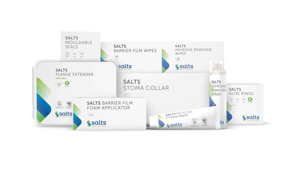
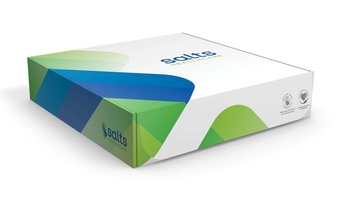
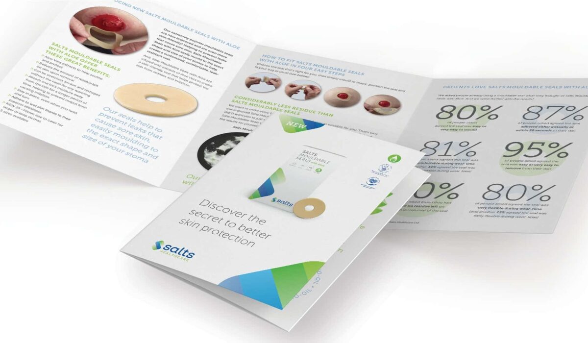
Packaging
All product names are now prefixed with “Salts” followed by a simple and accurate description of the product e.g. Salts Stoma Collar instead of Dermacol. They all feature the modernised logo.
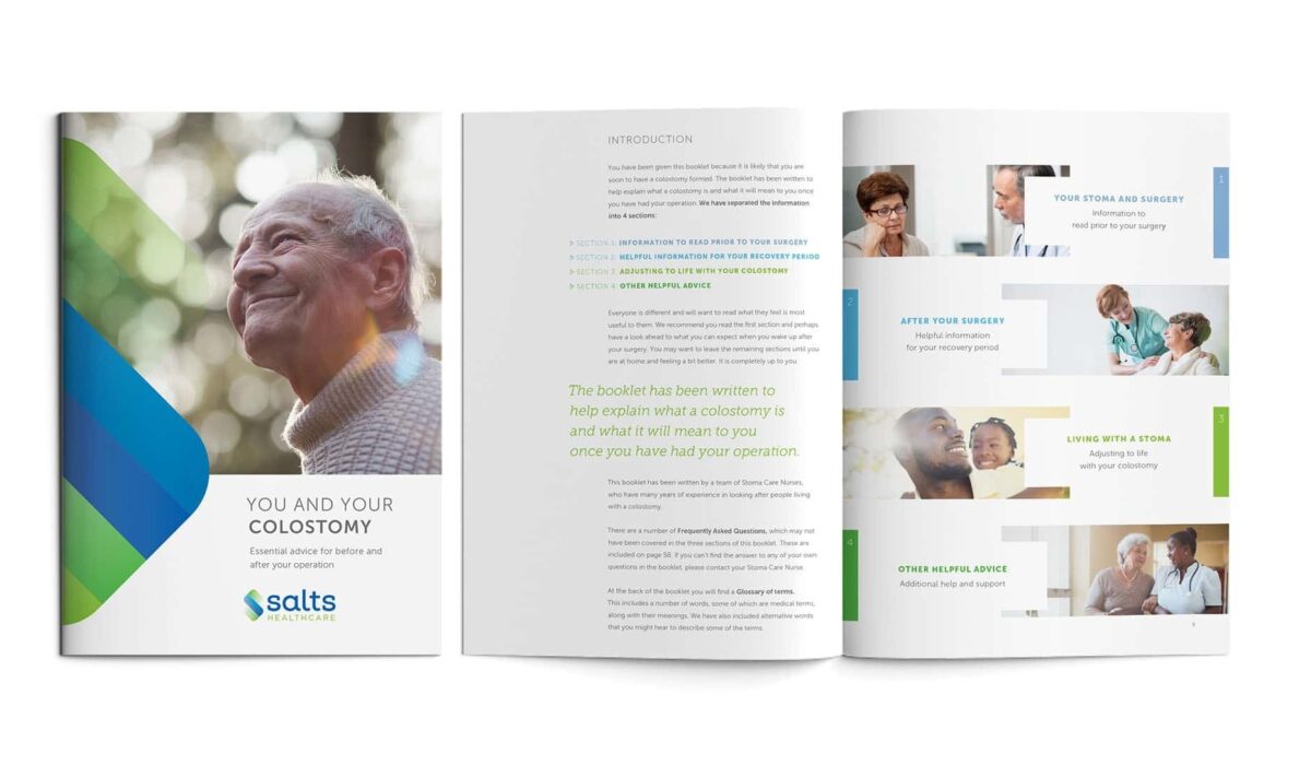
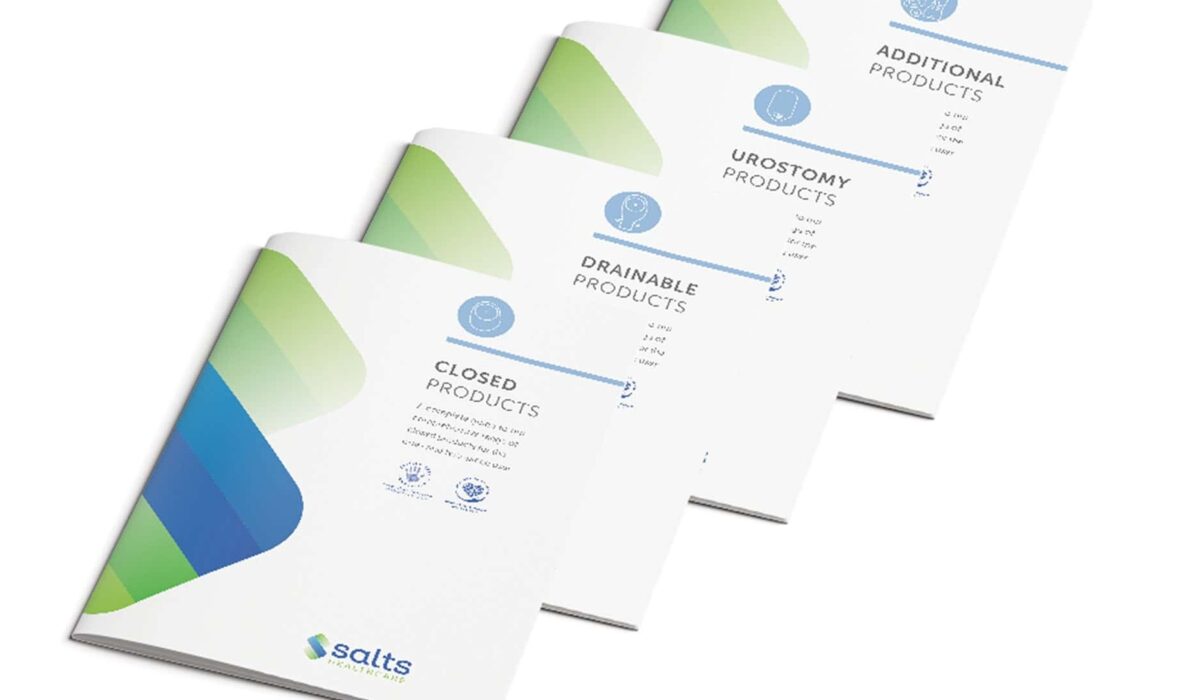
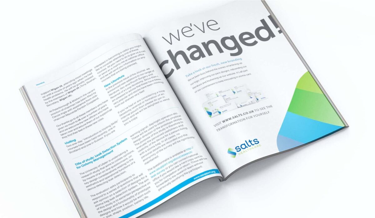
Literature
We created simple templates to ensure consistency across all communications and make it easier for different distributors to represent the Salts brand coherently. Everyone has access to an online asset library to make things easier.
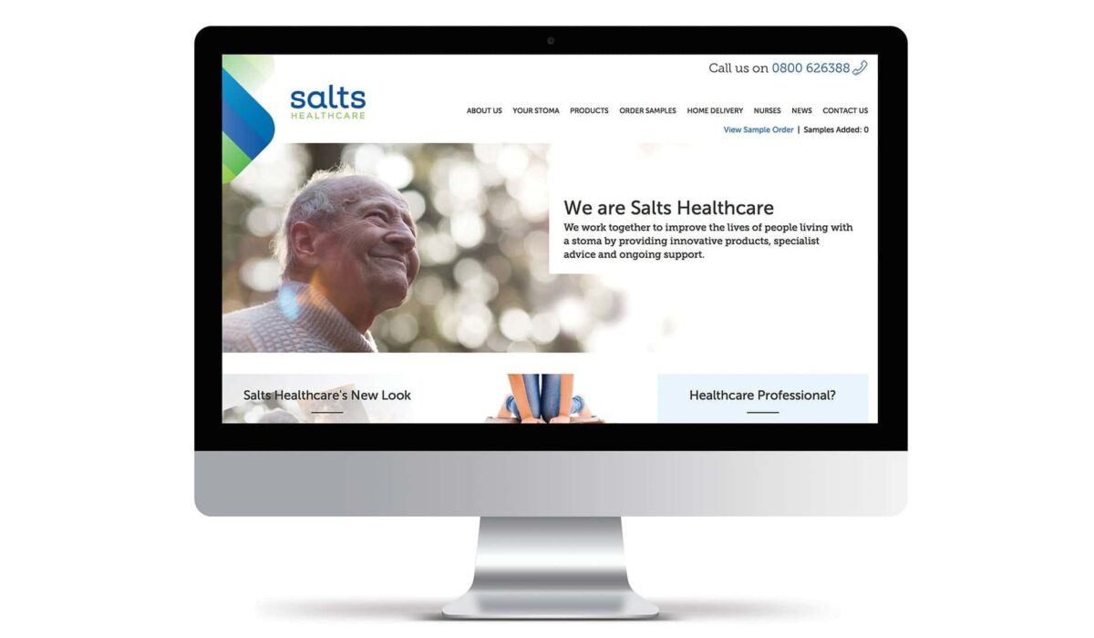
Website
The new Salts website is now live with even more information for ostomists and healthcare professionals. It features a new way to order samples and regular blog posts sharing the stories of inspirational ostomists.
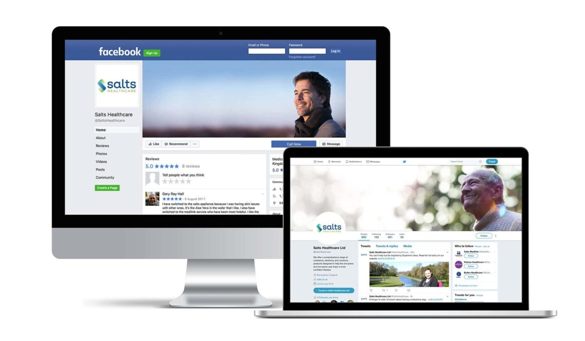
Social and digital marketing
Salts Healthcare now has a bigger presence on Twitter, Facebook and Instagram. Our copywriters help to create ideas for email templates and generate content to complement existing marketing activity.
Internal communications
We wrote and directed a corporate video to help Salts Healthcare communicate the new brand, vision and values to all members of staff, from the factory floor to delivery drivers, and helped them to coordinate a memorable launch event.