Outdoor Xpo
A trusted outdoor show, looking forward
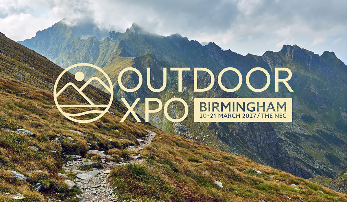
The National Outdoor Expo had built a loyal audience over many successful years.
The event was working hard, but the brand around it was starting to show its age, blending into a category that had settled into the same visual habit: mountains, bold serifs and a colour palette borrowed from every other outdoor event in the calendar.
Raccoon Media Group came to us with a clear brief. Give the show a brand identity as confident and forward-looking as the event itself.
Interpret + Define
Understanding what to protect and what to leave behind
A loyal audience and a respected reputation can be the hardest things to rebrand around. Push too hard and you walk away from what people already love. Hold back and the brand carries on blending in with a category that all looks the same.
The team needed clarity on what was earning the audience’s loyalty, what was holding the brand back and where the show needed to go next.
We worked closely with Raccoon Media Group to interrogate the brand from every angle. The audience, the exhibitors, the category around it and the future they wanted to build for the show.
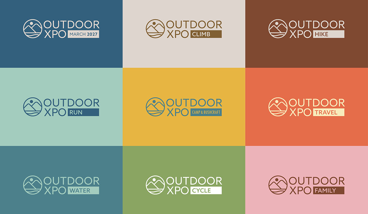
Part of that work was a name change. National Outdoor Expo became Outdoor Xpo. A small edit that gave the brand a much bigger sense of confidence: a shorter name, a sharper wordmark and a show that no longer needs to explain itself.
That gave us a strategic platform to design against, and a clear point of reference for every decision that followed.
Imagine + Create
A new identity built to behave like a brand, not an event
Event brands must work harder than most. Signage, digital, print, motion, exhibitor toolkits, social. They need a system flexible enough to scale across every touchpoint and disciplined enough to hold its character along the way.
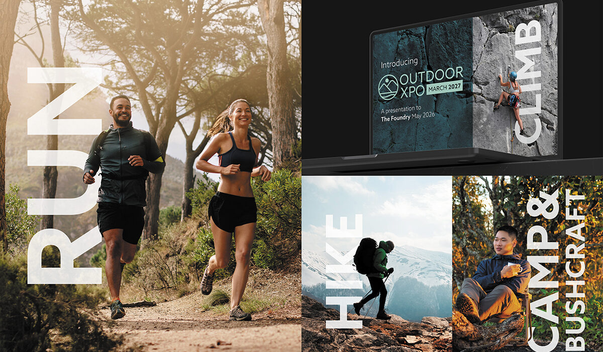
We built a new visual system from the ground up
A new logo, a confident wordmark built to lead the brand across every touchpoint. A new colour palette, a considered system that steps away from the visual defaults of the outdoor event category. A new imagery direction, a photography style that trusts the audience to recognise outdoor life without being told what it looks like. A new typographic system designed to work as hard as the event does, with the flexibility to behave the same way across signage, digital, print and motion.
The full identity was created in house by our creative team, then brought into motion by Drew Cox for the launch.
Rise + Shine
A new chapter for a trusted show
Raccoon Media Group launched the new identity with the confidence the show deserved. Early reception from the outdoor community and exhibitor base has been positive, and the new system is already proving itself across the full event ecosystem.
Outdoor Xpo enters its next chapter with a brand that finally matches the reputation of the event behind it.
Event brands work hardest when they stop trying to look like events and start behaving like brands.